
UI/UX DESIGN
WEB DESIGN
BRANDING
PACKAGING DESIGN
luxury skincare
Case Study — Invita Sense
Luxury Skincare Experience: UX, Visual Design & Prototyping
Overview
Invita Sense is a luxury skincare brand blending purity with high-end aesthetics.
Goal: Create a digital experience that communicates calm, trust, and sophistication while bridging physical packaging and e-commerce.
Approach: Full UX process — research → IA → flows → wireframes → clickable prototypes → UI → development → validation.
1. Research & Discovery
User Insights:
- Desire for clarity on ingredients & benefits
- Effortless, frictionless journey
- Minimal, curated interfaces
- Luxury perceived as calm, not cluttered
Market Review:
- Competitors: bold minimalism, black/neutral tones, editorial-style layouts, strong product photography
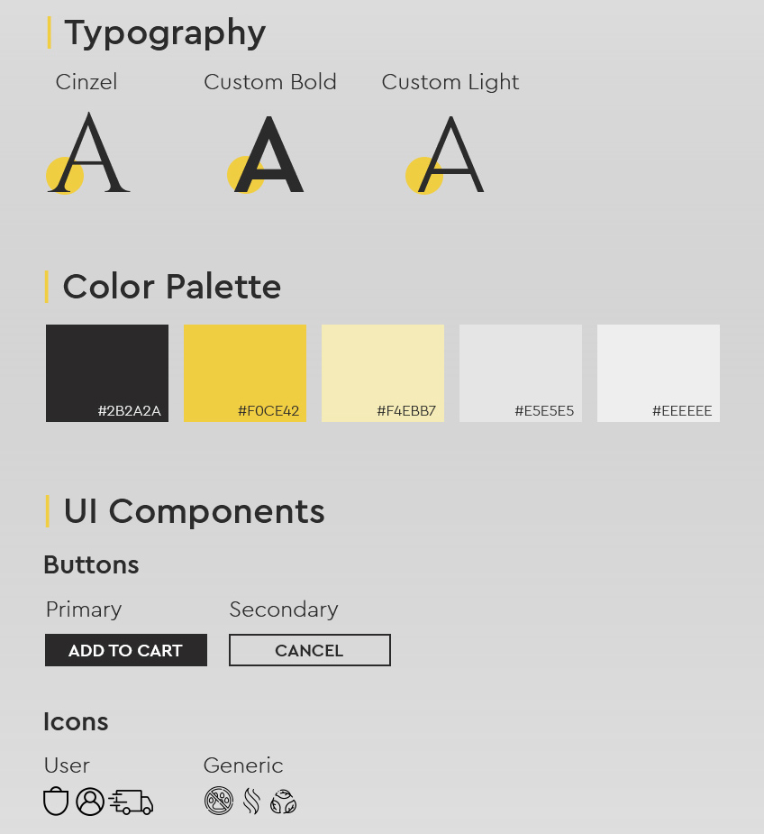
Visual Implication:
- Matte black backgrounds, gold accents, clean sans-serif typography
- Focus on emotional impact through hero visuals
2. UX Strategy & Information Architecture
IA Goals:
- Minimal categories for clarity
- Predictable navigation
- Spotlight on hero products
- Easy access to ingredients, routines, benefits
Simplified Structure:
Home → Shop → Product Detail → Cart → Checkout → Confirmation
Supporting: About / Ingredients / Philosophy / Contact / Journal
Storytelling Principle: Guide users from discovery → evaluation → confident purchase.
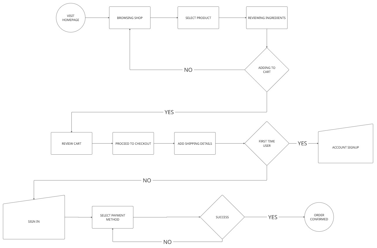
3. User Flows & Prototyping
Primary Flow: Discover → Purchase
- Landing on homepage
- Browsing hero imagery & featured products
- Selecting a product
- Reviewing benefits & ingredients
- Adding to cart
- Frictionless checkout
Trust & Luxury Enhancements:
- Transparent ingredients info
- Strategic social proof
- Subtle animations, soft transitions
Clickable prototypes tested flows, interactions, and luxury feel
4. Wireframes & UI Design
Wireframes:
- Defined content hierarchy, reading flow, and spacing
- Highlighted product images & trust signals
- Fast add-to-cart access
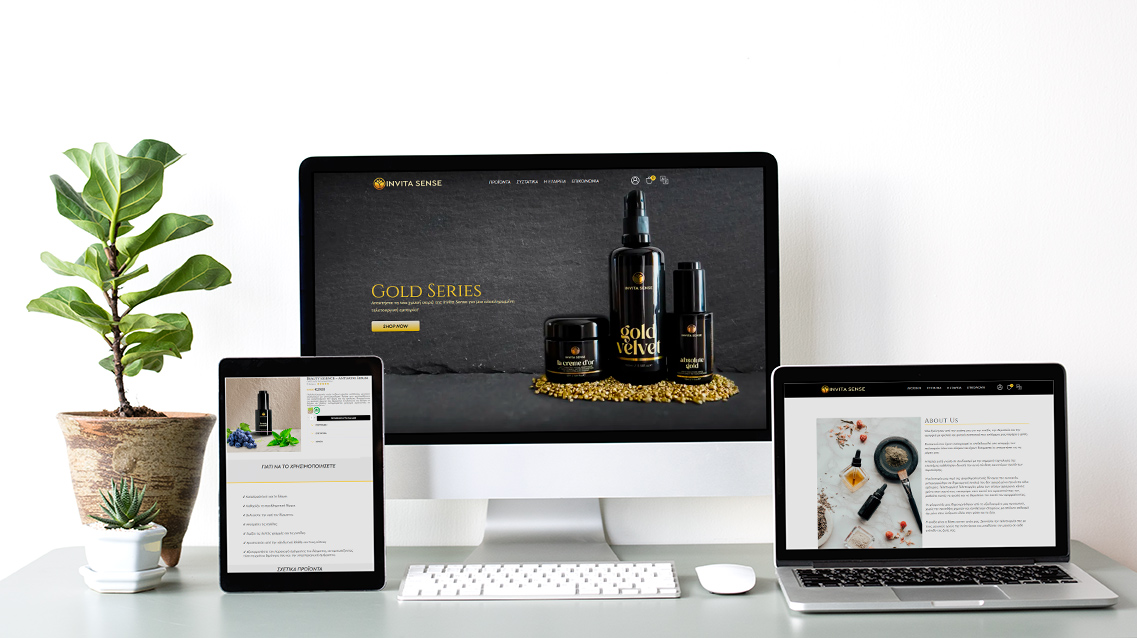
UI Design:
- Matte black + gold accents for premium feel
- Clean sans-serif typography
- Editorial-style product photography
- Structured grids with breathing room
- Calm, uncluttered storytelling from digital to packaging
5. Development
- Mobile-first responsive WordPress/WooCommerce
- Lightweight animations preserving premium feel
- Simplified checkout to reduce friction
- Custom UI components matching brand aesthetic
6. Validation & Final Checks
- Heuristic evaluation: clarity, consistency, minimalism
- Micro usability testing: navigation, checkout, mobile readability, perceived trust
- Users described the experience as: “clean, premium, calming, easy to use”
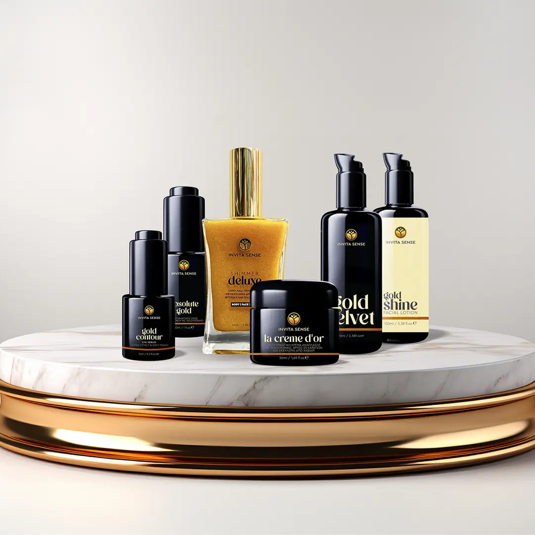
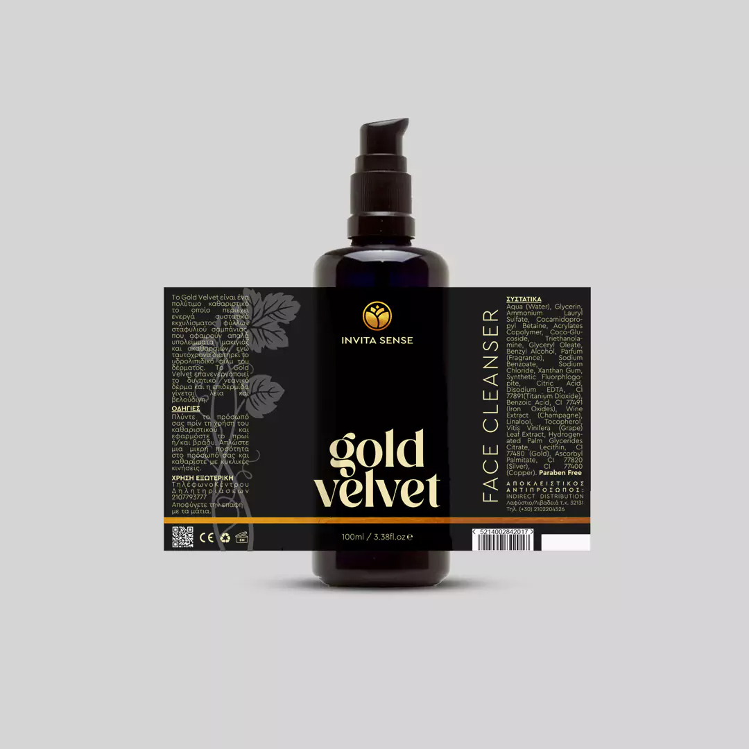
7. Outcome
- Complete luxury ecosystem: black-and-gold identity, packaging mirroring digital feel
- UX-driven e-commerce: simple, confident, elegant
- Clickable prototypes validated both usability and premium feel
- UI bridges sophistication and usability
Storytelling + Visual Design: The journey — from first packaging touch to final checkout — communicates trust, calm, and premium luxury.


Web design
